Stormhoek Blogosphere design
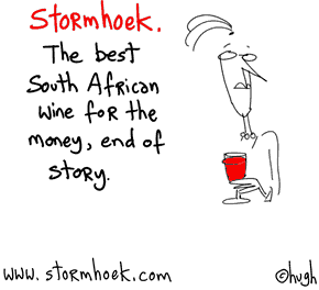
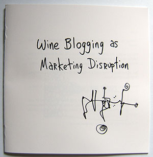
I have taken the liberty of copying and pasting some content from Hugh Macleod's amazing website Gaping Void. His entry on blogosphere design for Stromhoek is a fantastic example of the way that blog lead packaging design can work.
I encourage you to click here and find out what the fuss is all about.
"We've got a great litte wine from South Africa, which I've been blogging about.
Then we sent out some bottles to other bloggers, no strings attached, to see what they had to say about it. As they're fond of saying in the blogosphere, to start a conversation.
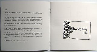
To see the leaflet that got sent out with the sample bottle click here.
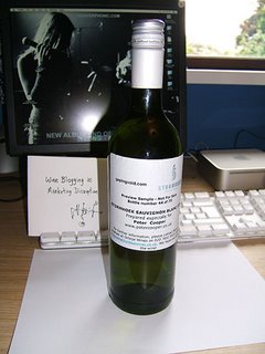
I did this not because I wanted to turn bloggers into wine pimps, but because, hey, I thought it would be fun. I thought it would be disuptive. I thought it would be my kind of thing.
So far it's working. The groovy cats at Stormhoek are happy. By interacting with the blogosphere [I call it "Taking the Cluetrain seriously"], it's changing the way the company see themselves, and the the way the wine trade sees them.
It's changing the brand. It's evolving the brand. Sales are up. Good things are happening, whether they want them to or not.
So what's next?
The bottle design.
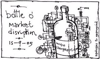
99% of people who go into wine shops do not read blogs. They've never heard of Stormhoek. A very small percentage may have read about it in the mainstream press (a lot of British wine writers like it, happily for us), but who can remember all those wine names you see in the Sunday papers? Sure, all the Cluetrain/Hughtrain stuff I'm doing for them is great for "The Internal Conversation" and "The Porous Membrane" etc etc, but as I've said again and again, 95% of Stormhoek's marketing to the customer happens on the supermarket shelf, in three seconds or less.
We need a new bottle design. A new label. Something that JUST. ISN'T. ABOUT. THE. FRICKIN'. WINE.
I told Nick Dymoke-Marr the Managing Director of Stormhoek: "You're not competing with Jacob's Creek or Blossom Hill. You're competing with Google and Microsoft and Apple and Skype.
Yes, the product category is always irrevelvant. It's not what you do, it's the way that you do it etc etc.
So I'm now on the hunt for a label & bottle design that better reflects the whole post-Cluetrain/Hughtrain schtick that Stormhoek is slowly becoming internally, that telegraphs this instantly to the external market.
Why shouldn't a small wine company see Apple or Google as its competition? Think how more interesting the world would be if more small, non-techie companies thought the same.
I'm looking for a new "look" for the bottle that sits there on the supermarket shelf. The look may require a new label a new bottle, or both. Something that conveys everything I've been talking about above.
Something that conveys what the brand is becoming in this crazy, post-Cluetrain, wired age of ours.
So here's the deal. Instead of the usual going to a graphic designers and giving them a formal "Cluetrain-savvy" brief (which 95% of them wouldn't understand properly, anyway) I thought I'd start the conversation by asking The Blogosphere if they have any ideas.
No, you don't have to be a graphic designer. An idea that works on the back of a cocktail napkin is just fine by me.
It's the idea, not the execution, that interests me at the moment.
Anybody who comes up with the winning idea, an idea we can actually run with, we'll pay them £1000.00 (roughly $2000 US). If you have an idea that might work, feel free to post it or a link to it on the wiki. Thanks.
If you know of any blogosheric designers and creatives out there, please pass this message along. Though yeah, this idea isn't just restricted to them."
The debate and flow of ideas continues and offers a brilliant insight into how blogospheric design can work. It engages key influencers, devolves some of the brand to the consumer and is fresh and exciting. The posts that follow share ideas of how to revolutionise the design. The caucus way of doing this seems to inspire some excellent ideas from a vast range of people. Often the best designers aren't designers at all.
Someone has created this little thought video which is a really interesting way of sharing ideas.
All the ideas are collected in this Wiki. It's a great way of bringing disparate minds together.
Great thanks to Gaping Void for this. It's one of the best marketing sites ever.
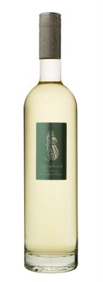
And here's the winning bottle:


2 Comments:
I saw Hugh Macleod present at a conference recently. What was particularly interesting was how a well-thought-through blog site turned this little winery into a very successful business.
This particular marketing/design idea is typical of him, and of Stormhoek.
Unique.
It's such a good idea and is such a good example of democratic marketing. I think I'll go and order a crate of Stormhoek now!
Post a Comment
Subscribe to Post Comments [Atom]
<< Home